Exercise 1: Experimenting with expressive lines and marks
In this exercise, I aimed to express feelings by drawings marks on A3 paper sheets using different materials. My experience in graphic design aided my understanding of how composition, the velocity of the lines and their direction are connected to expressing emotion.
Calm
Figure 1: Calm. Materials used from left to right: ink, charcoal stick, charcoal vine, pencil.
One of the thoughts that can bring calm for me is to visualise holding my sleeping children. I put some calming cinematic music and started drawing nonrepresentational images (Figure 1). I noticed that the lines were light, mostly long and floating, diagonal or horizontal with plenty of white space around. With the ink, I enjoyed painting with a wet and dry brush. With the charcoal, I used often the side of the stick. The charcoal vine was also enjoyable and smeared easily with my fingers to create hazy, soft lines. With the pencil, I was tempted to work in more detail and create organic circular lines.
Joy
Figure 2: Joy. Materials used from left to right: ink, charcoal stick, charcoal vine, pencil.
To get in the Joyful space of mind, I put some uplifting pop music. I noticed that I often made short, energetic strokes and outbursts of marks with upward direction (Figure 2). The pace of drawing was fast, and I exerted more pressure on the tools.
Anger
Figure 3: Anger. Materials used from left to right: ink, charcoal stick, charcoal vine, pencil.
For me anger means vicious cycle of thoughts that get darker and darker the more I dwell on what made me mad. My angry drawings (Figure 3) feature circular bold lines, dark value on the paper, hard pressure on the materials.
Fear
Figure 4: Fear. Materials used from left to right: ink, charcoal stick, charcoal vine, pencil.
The last emotion I wanted to experiment with was Fear. This was the trickiest feeling to depict. When I am scared I either run or freeze in one place. The ink painting have scattered lines representing mental frenzy and escape (Figure 4). The other three artworks have a more static composition, contained in the vertical centre of the canvas. While horizontal lines can be perceived as calm, here the vertical symmetrical composition expresses the fearful frozen state that is full of energy but static at the same time.
Sketchbook: Ink Studies
Following my examination of Jennifer Pastor's work, I was inspired to try some expressive drawings using nib pens where I can create a variety of thin and thick lines.
I tested several different nibs:
- Joseph Gillot Manga Nibs. These were fine but not great.
- Zebra Comic G. The nib was constantly running out of ink after just one stroke which made using them frustrating.
- Kuretake Zig Cartoonist Ink Dip Pen Holder and Nib Set. This is an excellent set - very comfortable holder and the nibs draw beautifully.
- Tachikawa Comic T-44 Nihonji Pen Nib. This set was very similar to the Zig and likely is produced by the same manufacturer. These nibs were recommended to me by a friend illustrator and they did not disappoint. Indeed they were the best I tested. The nib creates easily thin and thick lines and draws for a long time without running out of ink.
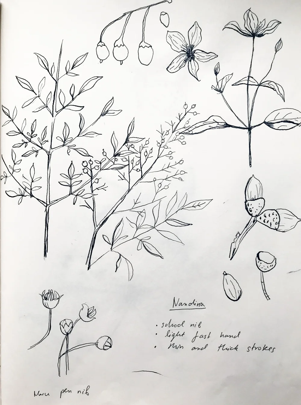
Figure 1. Botanical Sketchbook Studies, 2017. Draft pencil, ink and various Zig dip pen nibs on paper.

Figure 2. Butterfly Sketchbook Studies, 2017. Draft pencil, Ink, Zig Dip Pen and synthetic brush on paper.

Figure 3. Mushroom Sketchbook Studies, 2017. Draft pencil, ink, watercolor, Tachikawa dip pen and synthetic brush on paper.
While I enjoyed the clean and simple outline drawings made with the nib pens (Figure 1), I also wanted to experiment and contrast those with some ink brushwork (Figure 2 and 3). I find the combination of a dry and wet brush to result in some expressive and less fussy images which are not typical for me and therefore challenging. Finally, mixing the precision of the nib pen lines with dry brush marks led to the most interesting results in my view (Figure 3, bottom left corner).
I enjoyed the process which started with the inspiration from Jennifer Pastor's diagrammatical drawings and developed it further by experimenting with different tools. I also like adding some annotations to my drawings, similar to the way she has labeled parts of her images. While in her case, these annotations seem to resemble scientific notes and have underlying irony, in my drawings they are factual information.
Artist Spotlight: Jennifer Pastor
Recently, I acquired the book Drawing now : eight propositions (Hoptman, 2002) which was recommended for the drawing course. Within the very first pages, I was immediately attracted by the work of Los Angeles-based artist Jennifer Pastor. I usually overlook simple line drawings for the more flashy and bold paintings and illustrations. However, this volume gave me the opportunity to appreciate a quieter variety of pictures.
Pastor is known for her sculptures and for teaching Visual Arts at the University of California Irvine (Wikipedia). She often explores issues of space, body and object orientation.

Jennifer Pastor, Study for Fall, 1995. Drawing now : eight propositions
I was fascinated with two of her lesser-known works - Study for Spring (Pastor 1996) and Study for Fall (1995). The first features a diagram-like drawing of a moth. The second one is an exquisite rendering of corn stems where the plant appears almost transparent. The delicate style of Pastor appeals to my aesthetic for feminine and gentle drawings. Her lines are drawn with careful technical precision. The uniform, rigid marks of what is probably a draft pencil are contrasted with the fluidity and artistry of ink strokes. Her annotations on the drawings contain some bizarre mathematical measurements and scientific information. This gives the impression that the image is some sort of a technical or textbook illustration. On a second glance, it becomes clear that the annotations do not provide any factual information about the objects in the drawing which makes the piece somewhat ironic.
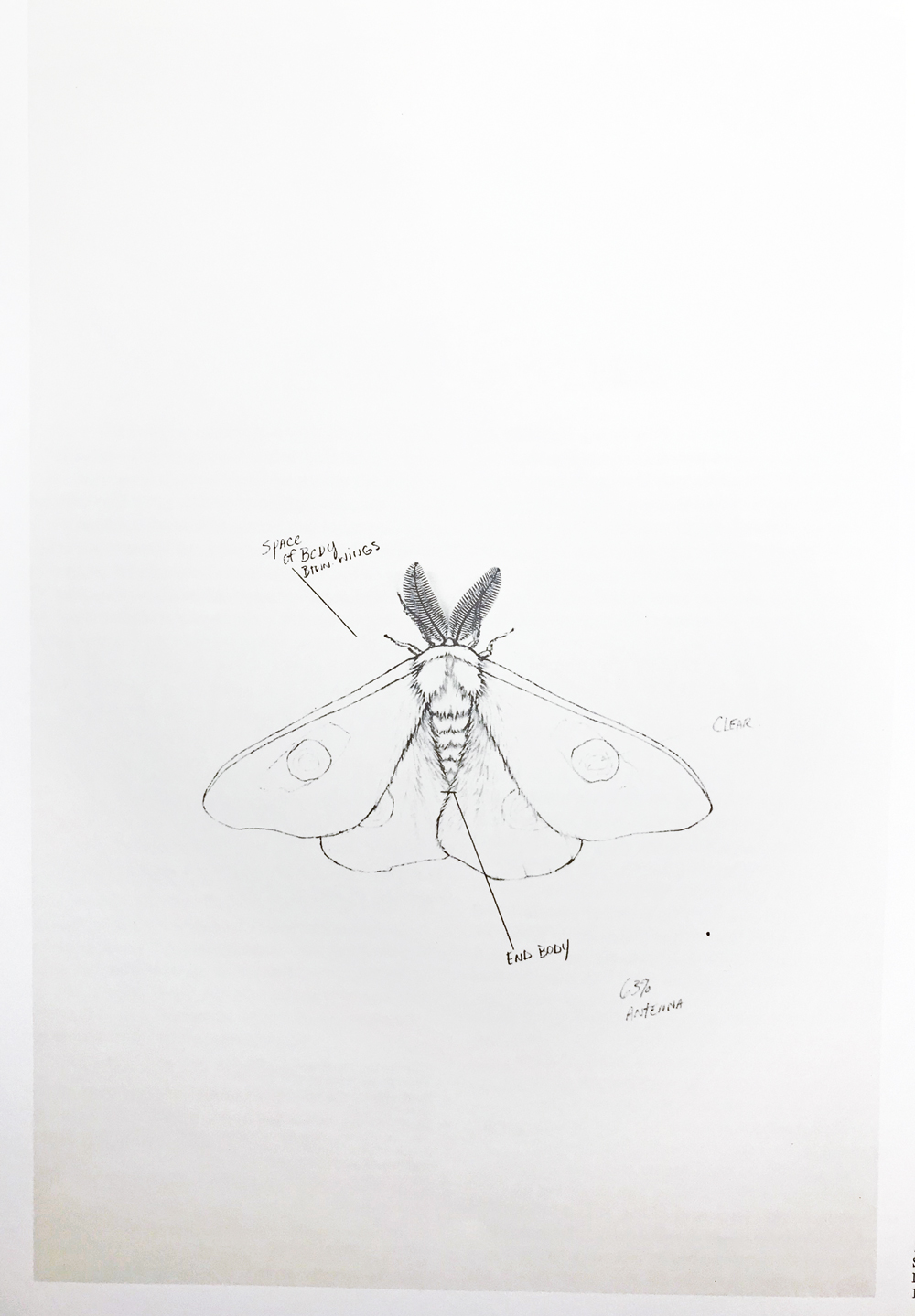
Jennifer Pastor, Study for Spring, 1996. Drawing now : eight propositions
Similar to Pastor, I usually seek a clean, realism-inspired, stylised look for my ink drawings. However, I use fibre tip pens that deliver uniform lines which suit well my design projects but are not as exciting. I would like to explore a more expressive type of drawing in the future similar to Pastor's mix of technical and artistic style.
Hoptman, L. J. (2002) Drawing now : eight propositions. New York: Museum of Modern Art.
Temporary Drawings
I found the idea of temporary drawings fascinating. From the beginning of my creative career, most of my pictures I created had some purpose. I either used them in greeting cards, graphic designs or sold them as stock images. Every time I would sit to draw it was to get the images I need for my projects quickly. This exercise of making fleeting marks was a reset on my attitude toward drawing. I understood that I should not feel precious or careful about my work at all times. This would lead to more freedom and exploration.
Below are some of my temporary drawings created using black tea leaves on a ceramic plate.
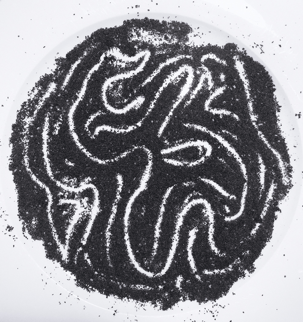


Temporary Drawings, 2017. Black tea leaves on a ceramic plate.